<!DOCTYPE html>
This line declares that this is an HTML5 document.
<html lang="en">This line indicates the beginning of the HTML document, and sets the language of the document to English.
<head>
  <meta charset="UTF-8">
  <title>Login Page</title>
  <style>
    ...
  </style>
</head>
This section is the head of the document. It contains meta information about the document (in this case, the character set), as well as the title of the document and the style section. In the style section, CSS is used to apply styling to the document.
body {
  margin: 0;
  padding: 0;
  font-family: Arial, sans-serif;
  background-color: #f2f2f2;
}
This block of CSS applies styling to the body element of the document. It sets the margin and padding to 0, applies the Arial font family, sets the background color to a light gray, and uses flexbox to create a flexible layout.
#login-box {
  width: 400px;
  background-color: #fff;
  border-radius: 5px;
  box-shadow: 0 0 10px rgba(0, 0, 0, 0.1);
  margin: 100px auto;
  padding: 20px;
  display: flex;
  flex-direction: column;
  align-items: center;
}
This block of CSS applies styling to the div with an id of “login-box”. It sets the width to 400px, the background color to white, adds a border radius and box shadow for a rounded and elevated appearance, sets the margin to 100px from the top and auto horizontally, adds padding for spacing, and uses flexbox to create a vertical layout with centered items.
h1 {
  font-size: 24px;
  font-weight: 500;
  margin-top: 0;
}
This block of CSS applies styling to the h1 heading element. It sets the font size to 24px, the font weight to 500, and removes the default margin at the top.
form {
  display: flex;
  flex-direction: column;
  width: 90%;
}
This block of CSS applies styling to the form element. It uses flexbox to create a vertical layout with centered items and sets the width to 90% to allow some spacing on the sides.
input[type="text"], input[type="password"] {
  width: 100%;
  padding: 10px;
  margin-bottom: 20px;
  border: 1px solid #ccc;
  border-radius: 3px;
  box-sizing: border-box;
  font-size: 16px;
}
This block contains styling rules for the button element with the attribute type set to “submit”.
button[type="submit"] {
  background-color: #4CAF50;
  color: #fff;
  border: none;
  border-radius: 3px;
  padding: 10px 20px;
  font-size: 16px;
  cursor: pointer;
  width: 70%;
  align-self: center;
}
button[type="submit"]:hover {
  background-color: #3e8e41;
}
This block contains styling rules for the button element with the attribute type set to “submit”.
background-colorsets the background color to a shade of blue.colorsets the font color to white.bordersets no border.border-radiussets the corner radius to 3 pixels, giving the button rounded corners.paddingadds 10 pixels of padding to the top and bottom of the button, and 20 pixels of padding to the left and right.font-sizesets the font size to 16 pixels.cursorsets the cursor to a pointer when hovering over the button, indicating that it’s clickable.widthsets the width of the button to 70% of its parent container.align-selfcenters the button horizontally in its parent container.
The second rule, button[type="submit"]:hover, is a pseudo-class that applies the following styles when the button is being hovered over:
background-colorchanges the background color to a darker shade of pink.
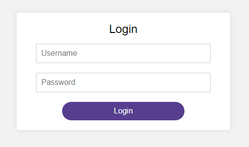
<body>
  <div id="login-box">
    <h1>Login</h1>
    <form>
      <input type="text" name="username" placeholder="Username" required>
      <input type="password" name="password" placeholder="Password" required>
      <button type="submit">Login</button>
    </form>
  </div>
</body>
This is the body of the document. It contains the content that will be displayed on the web page. In this case, it consists of a div with an id of “login-box”, which contains a heading, a form with two input fields for username and password, and a submit button.
This block of CSS applies styling to the input elements of type
Inside the style tags, we set some basic styling for the page. We set the margin and padding of the body element to 0 to remove any default spacing. We set the font-family to Arial, sans-serif to use a readable sans-serif font for the text. We set the background-color of the body to #f2f2f221 to give it a light gray background color.
The #login-box selector styles the login box itself. We set the width to 400px, background-color to #fff (white), border-radius to 5px to give it rounded corners, and box-shadow to give it a slight shadow effect. We set the margin to 100px auto to center the box on the page horizontally and create a bit of space between the box and the top of the page. We also set padding to 20px to give some space inside the box. Finally, we set display to flex to allow us to use flexbox properties to center the contents of the box.
The h1 selector styles the “Login” heading at the top of the box. We set the font-size to 24px, font-weight to 500 to make it a bit bolder, and margin-top to 0 to remove any default spacing above it.
The form selector styles the login form itself. We set display to flex and flex-direction to column to align the form elements vertically. We also set the width to 90% to make the form slightly narrower than the login box.
The input[type=”text”], input[type=”password”] selector styles the input fields for the username and password. We set the width to 100% to make them fill the width of the form, padding to 10px to add some space inside the fields, margin-bottom to 20px to add some space between the fields, border to 1px solid #ccc to give them a light gray border, border-radius to 3px to give them rounded corners, box-sizing to border-box to include the border and padding in the width of the elements, and font-size to 16px to make the text legible.
The button[type=”submit”] selector styles the login button. We set the background-color to #573e8e (a green color), color to #fff (white), border to none to remove any borders, border-radius to 3px to give it rounded corners, padding to 10px 20px to add some space inside the button, font-size to 16px to make the text legible, cursor to pointer to show that it’s clickable, width to 70% to make it slightly narrower than the form, and align-self to center to center it horizontally within the button.
The button[type=”submit”]:hover selector styles the login button when the mouse is hovered over it. We set the background-color to #ff1493 (a deep pink color) to give it a highlight effect.
Complete Code is here :
<!DOCTYPE html>
<html lang="en">
<head>
  <meta charset="UTF-8">
  <title>Login Page</title>
  <style>
    body {
      margin: 0;
      padding: 0;
      font-family: Arial, sans-serif;
      background-color: #f2f2f221;
    }
    #login-box {
      width: 400px;
      background-color: #fff;
      border-radius: 5px;
      box-shadow: 0 0 10px rgba(0, 0, 0, 0.1);
      margin: 100px auto;
      padding: 20px;
      display: flex;
      flex-direction: column;
      align-items: center;

    }
    h1 {
      font-size: 24px;
      font-weight: 500;
      margin-top: 0;
    }
    form{

    display: flex;
    flex-direction: column;
    width: 90%;

	}
    input[type="text"], input[type="password"] {
      width: 100%;
      padding: 10px;
      margin-bottom: 20px;
      border: 1px solid #ccc;
      border-radius: 3px;
      box-sizing: border-box;
      font-size: 16px;
    }
    button[type="submit"] {
      background-color: #573e8e;
      color: #fff;
      border: none;
      border-radius: 3px;
      padding: 10px 20px;
      font-size: 16px;
      cursor: pointer;
      width: 70%;
      align-self: center;
      border-radius:30px
    }
    button[type="submit"]:hover {
      background-color: #ff1493;
    }
  </style>
</head>
<body>
  <div id="login-box">
    <h1>Login</h1>
    <form>
      <input type="text" name="username" placeholder="Username" required>
      <input type="password" name="password" placeholder="Password" required>
      <button type="submit">Login</button>
    </form>
  </div>
</body>
</html>